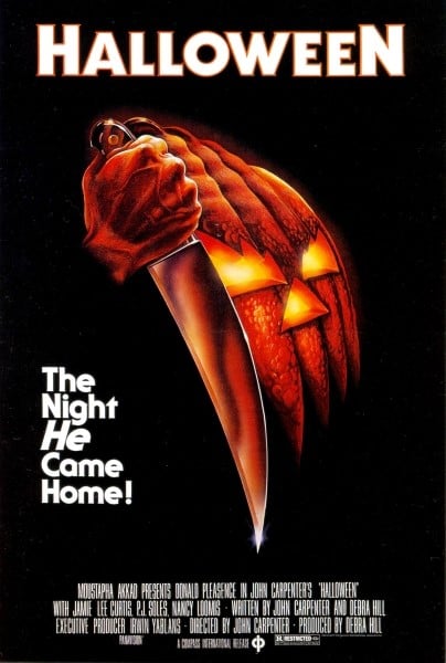
The form conventions of a movie include the movie title and how it is written; in other words the type of font and color that it is used.

In the movie The Exorcist the font that it is used is serious, sort of catholic, it also uses bloody red that helps the audience the terrible things that are going to happen in the film. The poster makes individuals feel fear without having any context on what the film is about. Although with the title alone one can predict sort of what is going to happen in the film; one can denote something paranormal is going to happen along with something religious.

The font that is used for horror classic Nosferatu has a Gothic feel to it. It is inspired by the aesthetics of German expressionism and art nouveau. The film is dark and has a disturbing framing as well as sharp contrasts. The movie’s gloominess is perfectly translated by the font used in the title.

The title Halloween is presented on a black background with the letters in bold white writing with an orange border. It is Gothic, due to its subtle sharpness on the orange borders, but at the same time modern. The day of Halloween is already associated with creepy themes, so one can already tell the movie is going to be horror just by the title alone.